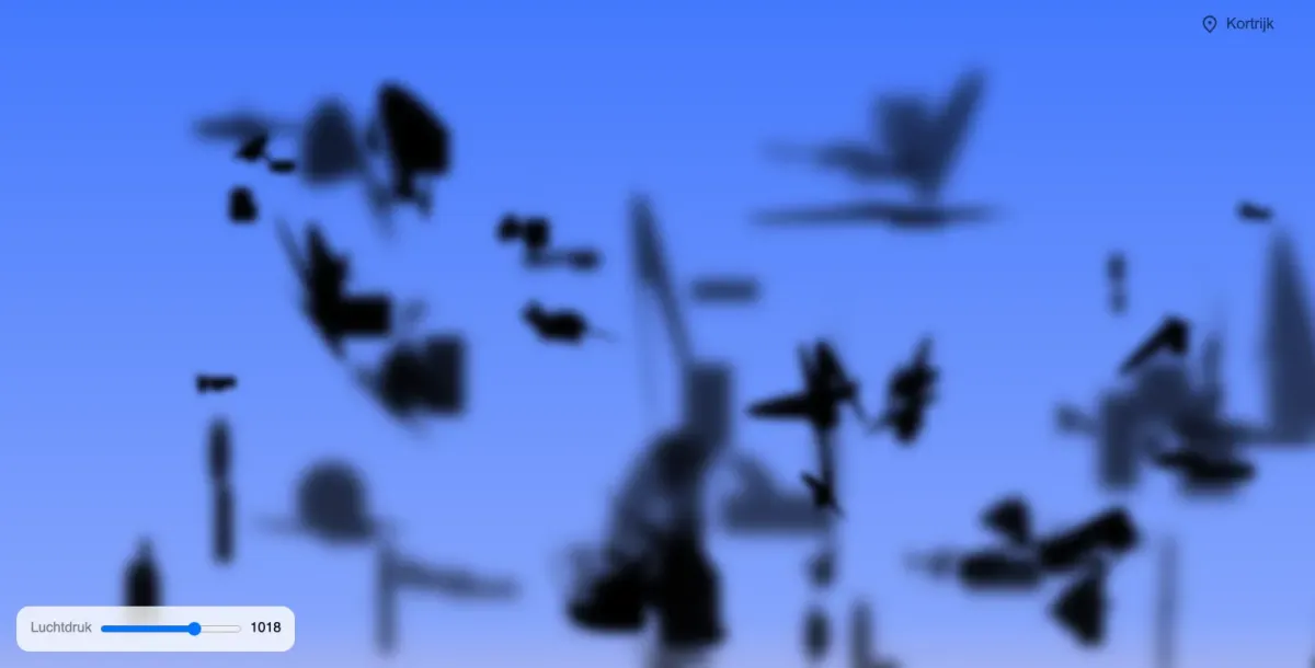
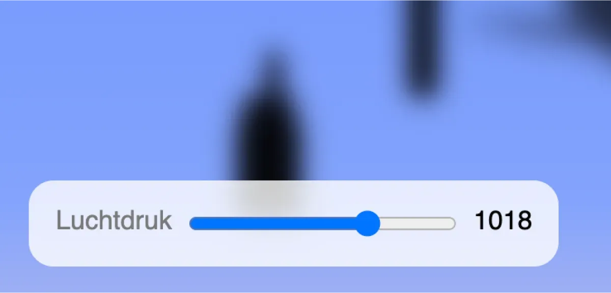
Challenged to visually represent data from the Weather API, I opted for air pressure. Injecting humor into the project, I explored the concept of how "druk" (busy/pressured) the air could be. The result: a dynamic visualization where air pressure shapes silhouettes of random objects in the sky. Users can manipulate the data in the bottom left corner and change the location in the top right.


Have a question? Feel free to reach out!
Feel free to ask anything or reach out for a conversation about my projects!
Get in touch